
As part of the preparation for designing the book cover for a novel, I always read the manuscript first. An early pet peeve of mine when I was a child was getting a book out from the library based on an intriguing cover illustration and discovering that the content didn’t match at all. So now, as an adult, I always read the book first before designing. Hopefully I’ve avoided disappointing readers!
There have been only two books so where this was a pitfall. I generally read manuscripts on my train ride back home to the San Francisco East Bay, but twice I’ve read books that were so immersive that I forgot where I was and missed my stop. The Flying Inn is one of them. (The other is Ceremony of Innocence.)
The Flying Inn is G. K. Chesterton’s ode to the joy of everyday pleasures: food, drink, nature, dogs, friendship, song, and laughter. Written in 1914 during a time when eugenics, the Temperance movement, and Orientalism were in vogue among the politically powerful, Chesterton lampoons these trends hilariously. In some cases, he’s quite prophetic: in his prediction of a society that has embraced prohibition, the wealthy and well-connected get medical prescriptions for liquor and purchase it at the local pharmacy, a scenario which came true in America after prohibition. (Whisky was still available, but encased in a cardboard box touting its medicinal status.)
Orientalism was a broad movement that included many elements, but as depicted in The Flying Inn it’s a condescending attitude toward other cultures and religions that sees them as a cabinet of interesting images and ideas to be raided and reassembled into an exotic repackaging of dry progressivism. The book’s antagonist, Lord Ivywood, finds a crank preaching to passersby about the supposed Islamic origins of England. Ivywood, of course, doesn’t believe a word of it. But it’s a useful vehicle for his progressive ideology, so he begins hosting the man’s talks, spinning the eccentric’s views into respectable public thought so as to provide a framework for Ivywood’s political machinations.
Our heroes are Captain Patrick Dalroy and pub owner Humphrey Pump. When two laws are passed, one outlawing pub signs and another outlawing serving alcohol in any establishment without a sign, Dalroy and Pump go on the run with the sign from Humphrey’s pub, The Old Ship. Along with a barrel of rum, a wheel of cheese, and Lord Ivywood’s own dog, they travel the countryside setting up the sign just long enough for a round of drinks. With Ivywood on their tail, it becomes clear that a confrontation will have to take place at some point.
Chesterton structures the novel episodically, with each new encounter escalating in outlandishness, each new character painted in colorful detail. An obtuse journalist nicknamed Hibbs However is one of my favorites:
In his early days he had had a great talent for one of the worst tricks of modern journalism, the trick of dismissing the important part of a question as if it could wait, and appearing to get to business on the unimportant part of it. Thus, he would say, “Whatever we may think of the rights and wrongs of the vivisection of pauper children, we shall all agree that it should only be done, in any event, by fully qualified practitioners.” But in the later and darker days of his diplomacy, he seemed rather to dismiss the important part of a subject, and get to grips with some totally different subject, following some timid and elusive train of associations of his own. In his late bad manner, as they say of painters, he was just as likely to say, “Whatever we may think of the rights and wrongs of the vivisection of pauper children, no progressive mind can doubt that the influence of the Vatican is on the decline.”
Chesterton makes serious points through his satire without sacrificing the comedic aspects. Dalroy and Pump come across a decadent poet who ends up having a spiritual awakening after being abandoned in a forest with a donkey, a cult devoted to drinking nothing but milk, a pharmacist who has effectively become a barman, and a fiercely intelligent woman who Captain Dalroy falls in love with.
And I haven’t yet mentioned the songs! The songs are the highlight of the book, and many who have never read The Flying Inn are nevertheless familiar with the drinking songs that Captain Dalroy and Humphrey Pump sing as they travel. The Rolling English Road, The Logical Vegetarian, The Song of the Dog Quoodle, Wine and Water, The Song of Right and Wrong, and many others are featured in this book.
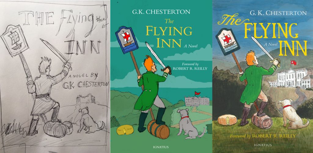
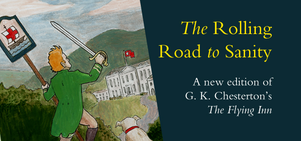
The Cover Design
As with the cover of Manalive, I wanted to go with an illustration for this book rather than use photography. When designing a book cover, the choices of color, art, and typeface all signal what kind of book it is. I wanted this cover to convey a sense of adventure as well as a sense of playful fun.
I settled a solid idea for the cover—I wanted Captain Dalroy, the dog Quoodle, and rum, cheese, and signpost all to feature on the cover, as well as the Ivywood estate in the background. From there I did a rough sketch to show to our art director, Roxanne Lum. After the concept was approved I did a series of sketches to solidify the pose and also some color tests for basic color ideas.
Then back to reading the book! I verified various elements such as Dalroy’s uniform and Quoodle’s breed. I looked around online for images of rum casks and English country homes, and also posed for a snapshot in Dalroy’s pose so I had a figure reference. The illustration was done with pencil, watercolor, pen, and acrylics on Bristol board.
After trying a few title setups that I wasn’t happy with, I came across an early edition of The Flying Inn that had a title typeface that I liked quite a bit. I decided to hand-letter a version inspired by it that would keep a handmade, playful feel.
Final adjustments to the color were made digitally, and it was off to the printer!
If you’d like to see a brief video about my cover design and illustration of the book, check it out below.
Looking at the cover design and illustration process for GK Chesterton’s “The Flying Inn”.
Posted by Ignatius Press on Thursday, August 3, 2017

jaroslav karban
March 6, 2018 at 2:43 am
Mr. Pump was standing immediately under his inn sign: which stood erect in the turf; a wooden pole painted WHITE and suspending a square wooden board, also painted white, but further decorated with a highly grotesque BLUE ship, such as a child might draw, but into which Mr. Pump’s patriotism had insinuated a disproportionately large red St. George’s cross.
:-)